CHIVES - Interaktive Medien
Repositioning a digital agency through a more modern, modular, and future-ready website.
Scroll ↓
The redesign aimed to strengthen CHIVES digital presence by aligning the website with its new corporate identity, improving content structure, and creating a more scalable system for projects, editorial content, and responsive experiences.
ROLE
UX/UI Designer
FOCUS
Content Hierarchy
Responsive Design
Scalable UI Patterns
DELIVERABLES
Wireframes
High-Fidelity UI Design
Component Library
Challenge
The previous website no longer reflected CHIVES capabilities or modern approach. Content was hard to scan, project presentation was inconsistent, and the system lacked flexibility for future growth.
Outdated visual design and weak brand presence
Inconsistent layouts and limited modularity
Poor content hierarchy and readability
Not optimized for mobile and future scalability
Before / After
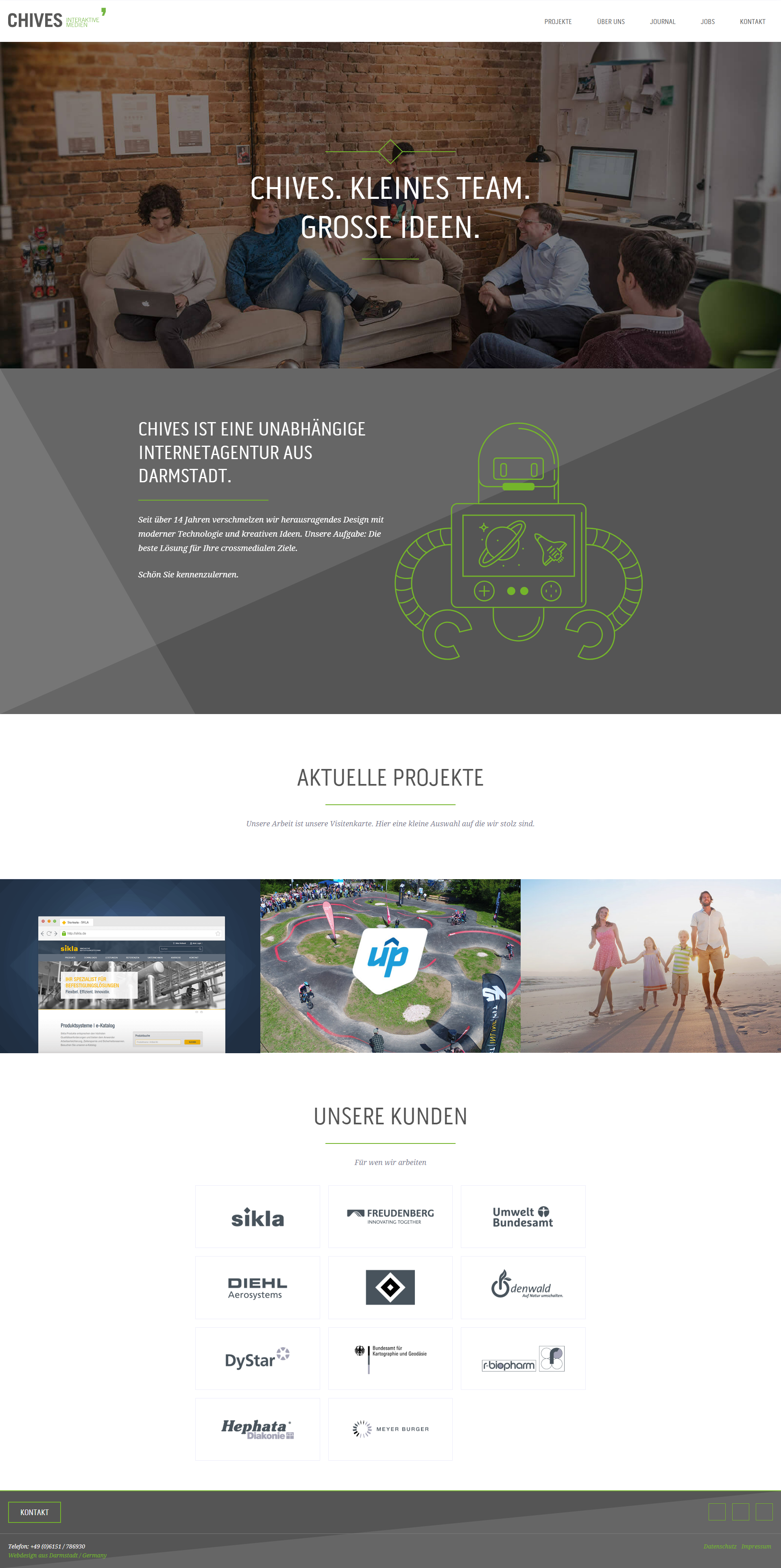
Before: static structure, weaker hierarchy, less consistent project presentation.

After: stronger hero, clearer modular structure, better project visibility.
Approach
The redesign started with structure. Before moving into visual refinement, I explored how hierarchy, section flow, and content grouping could better communicate the agency’s offering and bring projects more clearly into the foreground.
From there, the focus shifted to building a modular layout system that could support responsive behavior, improve scanability, and create a more flexible foundation for future content.
Early Layout Exploration
Before moving into visual refinement, I explored different homepage structures to define a clear hierarchy and a more modular way of presenting the agency’s content. These early sketches focused on content flow, section composition, and scalable layout patterns rather than visual styling.
Explored a straightforward homepage architecture with a clear vertical flow and modular sections. The focus was on content hierarchy, readability, and easier navigation.
Explored a more dynamic composition with greater emphasis on hero messaging and page rhythm, while maintaining a clear modular structure.
Wireframe
This wireframe phase focused on defining the homepage structure before moving into visual refinement. The goal was to establish a clear content hierarchy, introduce the agency early through the “Über uns” section, give featured projects more prominence than smaller blog stories, and create stronger contact entry points toward the end of the page. Working in a modular grid also helped shape a layout system that could scale consistently across sections and later adapt more easily to responsive versions.
Key Design Decisions
1. Clear hierarchy
A clearer content structure improves scanability, sharpens focus, and makes the agency’s offer easier to understand at a glance.
2. Modular system
Reusable components create consistency across pages and support flexible updates without redesigning each section from scratch.
3. Project-first showcase
Projects were brought into the foreground through stronger teasers, clearer grouping, and a more consistent overview structure.
4. Clear contact paths
Contact opportunities were made more visible and easier to access, helping potential clients move from browsing to taking action.
Layout System
The redesign was built as a modular layout system that could support different content types while maintaining a consistent visual language. Rather than relying on one fixed page structure, the website uses reusable patterns to present projects, editorial content, brand-driven company pages, and contact touchpoints in a cohesive way. The following examples show how the system works across overview pages, detailed project storytelling, supporting content modules, and responsive screens.
Project Showcase
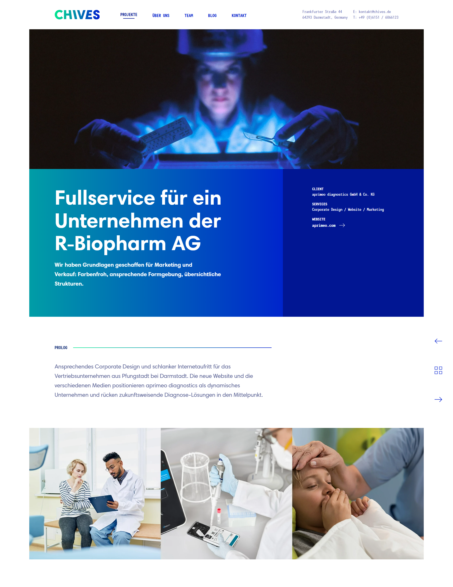
This intro section was designed to give each project a stronger and more immersive entry point. A large lead image and bold headline create immediate visual impact, while key project information is structured alongside the intro for quick scanning.
The integrated side navigation also supports a smoother browsing flow by letting users move directly to the next project, previous project, or back to the overview.
This section shows the website beyond static screens. The embedded navigation video helps make the experience more tangible by showing how users move through the interface, how content is structured, and how the browsing flow works in practice.
Flexible content patterns
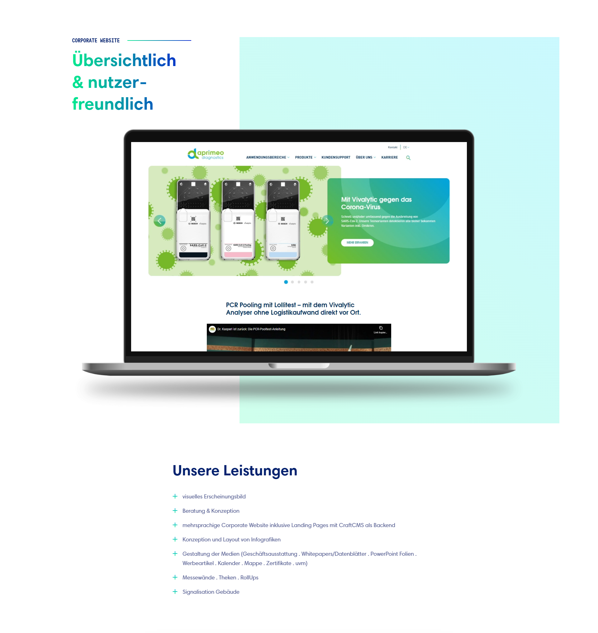
This example shows how the modular system extends beyond project presentation into brand-driven and editorial content.
Iconography, structured content blocks, and consistent spacing help translate the corporate identity across different page types while maintaining visual cohesion.
Components
Navigation, cards, and buttons were designed as a consistent component system across the website. Shared patterns improve scanability, unify interactions, and create a more cohesive experience across different page types and screen sizes.


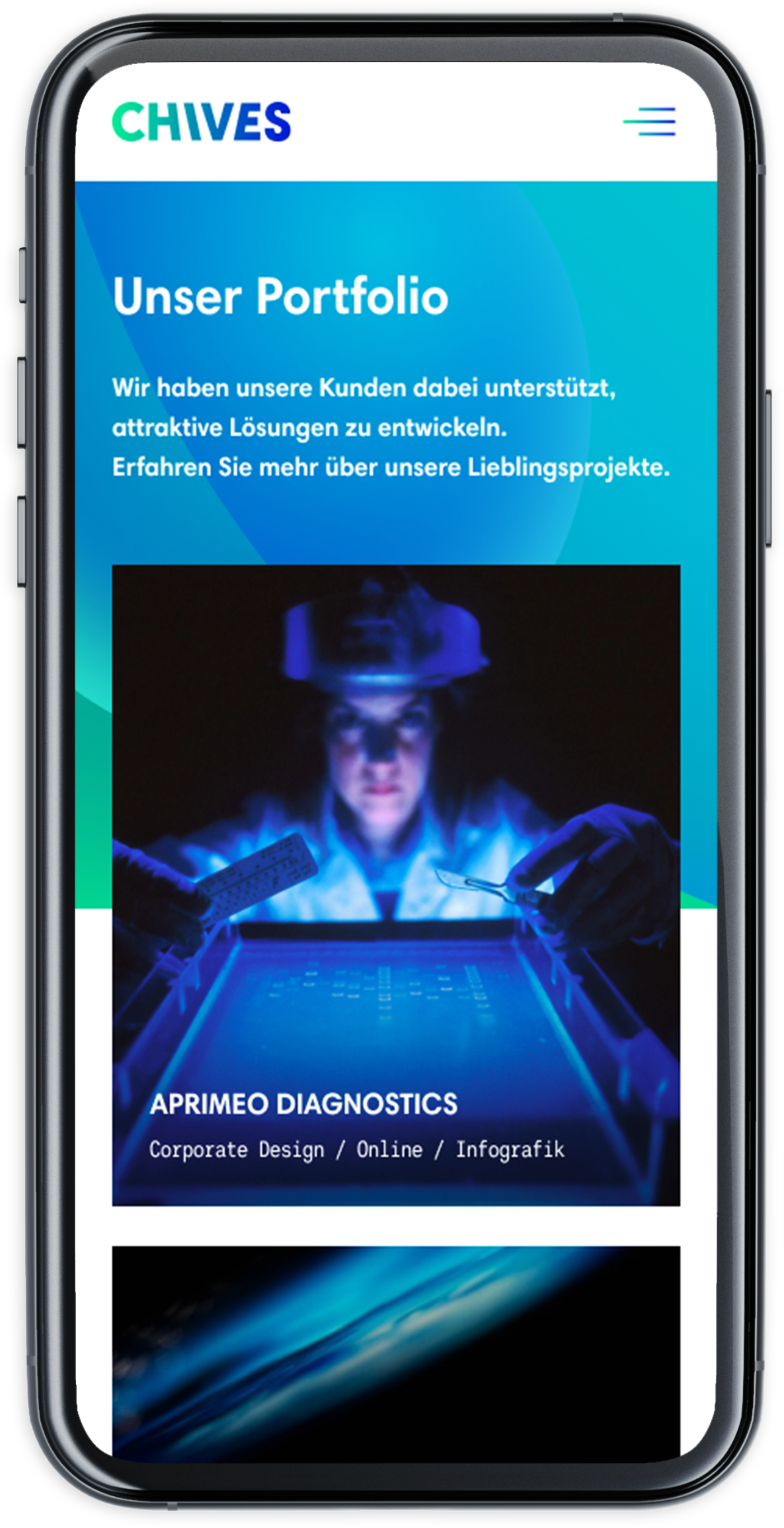
Mobile Screens