
aprimeo diagnostics - Corporate Design & Website
Bringing clarity to High-Tech Diagnostics.
Scroll ↓
Aprimeo Diagnostics was a new product launch. I created the visual identity and a clean, approachable UX—highlighting both the analyzer and cartridge capabilities so labs could easily understand the product and take action.
ROLE
UX/UI Design
Visual Identity
Information Architecture
FOCUS
Product Communication
Technical Clarity
User Engagement
DELIVERABLES
Website Design
Design System
Interactive Infographics
Challenge
The challenge was to shape the entire user journey from scratch. With no existing content or structure, the platform had to balance technical precision with an experience that remained clear and easy for lab professionals to navigate.
Helped define intuitive user flows from the ground up.
Balanced technical depth with approachability.
Ensured lab decision-makers could explore detailed product data while always finding clear guidance.
Incorporated prominent calls-to-action for contact.
Dedicated a support section for client assistance.
Website Journey
With no prior structure, the user flow was defined from the ground up. This helped labs navigate from understanding the product to taking action, with each step aligned to their needs.
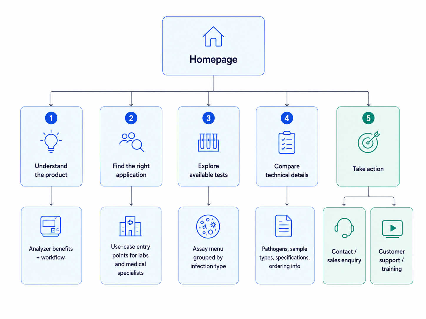
This user-flow map shows how the website was structured around different levels of user intent — from first understanding the analyzer to exploring specific assays, comparing technical information, and taking action through sales or support touchpoints. The goal was to make a complex diagnostic product easier to navigate without removing the technical depth needed by laboratory decision-makers.
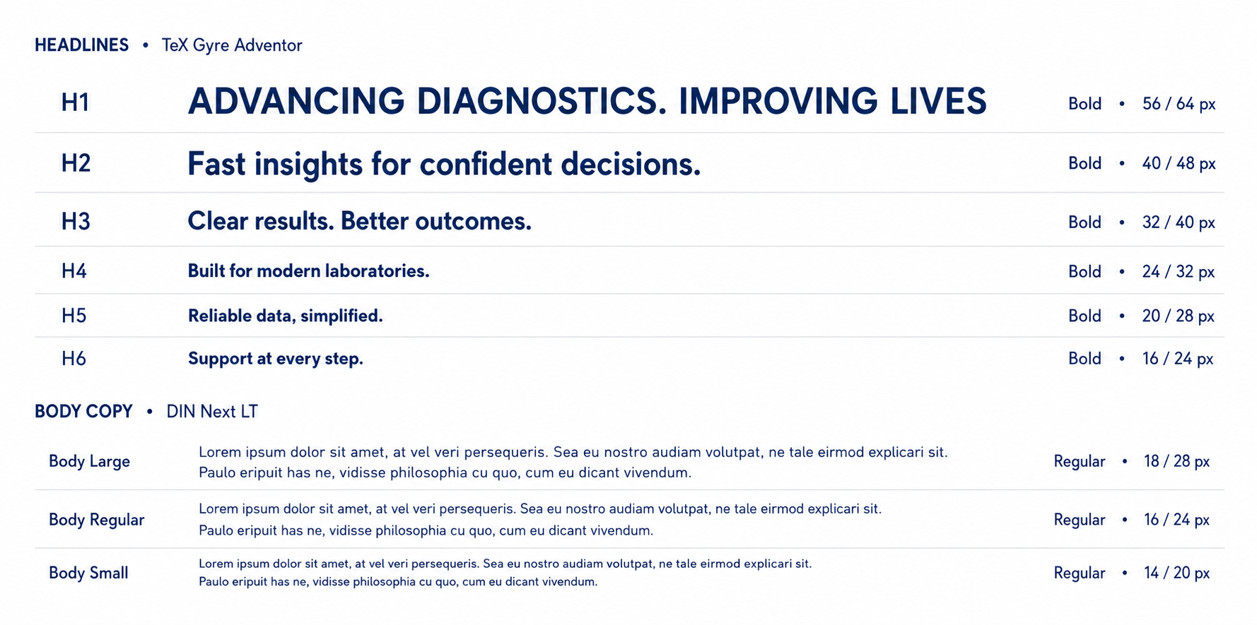
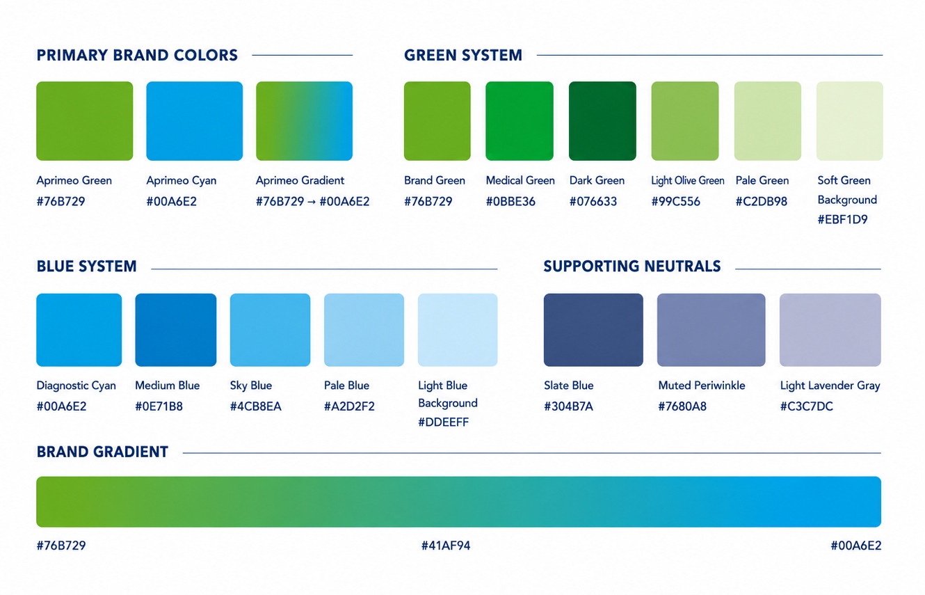
Visual Direction
Starting from the existing logo, the visual direction was expanded into a broader digital system of colors, typography and graphic elements. The goal was to connect Aprimeo’s brand with the product’s diagnostic context while keeping the experience clean, approachable and easy to navigate.
Applying the Visual System
Once the core visual language was defined, it was applied across both promotional and content-driven sections. Product photography, circular brand shapes and bold messaging helped create a consistent experience from campaign-like entry points to more functional website modules.
Product-led campaign visual
Brand-derived circular shapes, product photography and bold messaging were combined to create a clear, promotional entry point for the analyzer.
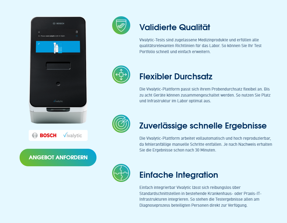
Content-driven website module
The same visual language was applied to more functional sections, using icons, hierarchy and CTA placement to explain key product benefits.
Interface & Content Structure
The website was structured as a modular product platform, allowing users to move from a high-level product introduction to more specific application areas, test information and technical details. Each section was designed to balance quick understanding with access to deeper diagnostic information.

The homepage introduced the product through multiple entry points, allowing users to explore the analyzer, available tests, application areas, news, support and contact options from one central overview.

Dedicated application pages translated the product benefits into more specific use cases, combining product imagery, benefit cards, workflow steps and a strong CTA for sales enquiries.
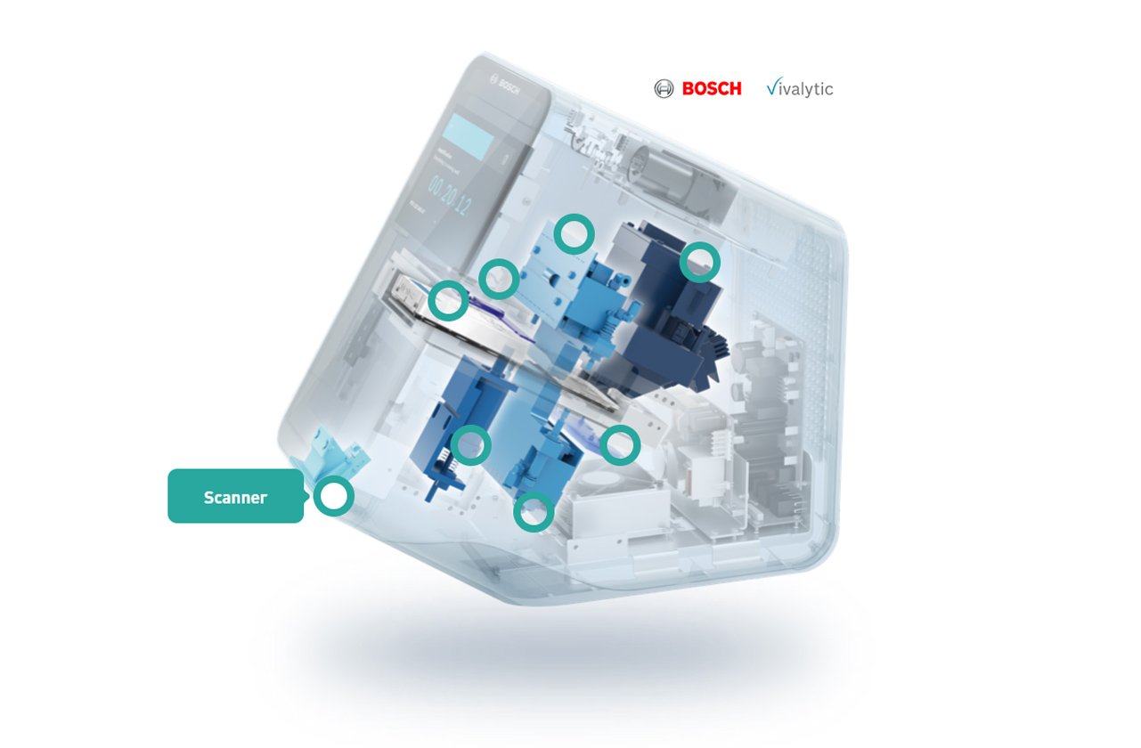
Technical content was supported with visual explanations and product-focused graphics, making complex diagnostic information easier to scan and understand.
Modular Components
To keep the platform scalable and easy to navigate, the website was built around reusable modules. A consistent component system supported page intros, category navigation, assay discovery and contact touchpoints across the site.
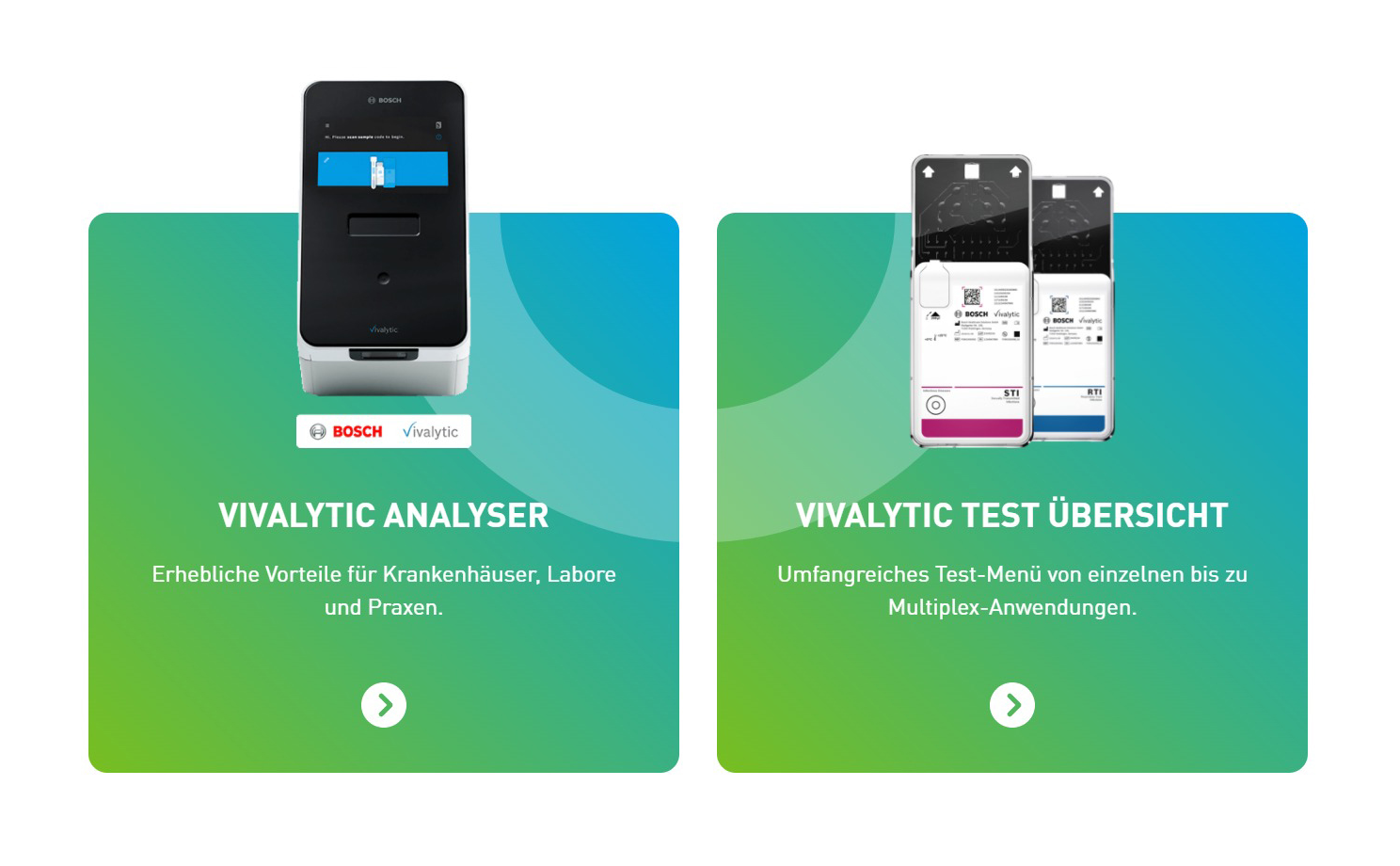
Product Navigation Cards
These cards acted as high-level entry points into the two main product areas: the Vivalytic analyzer and the test overview. Large product imagery, bold titles and simple directional CTAs helped users quickly decide which part of the platform they wanted to explore next.
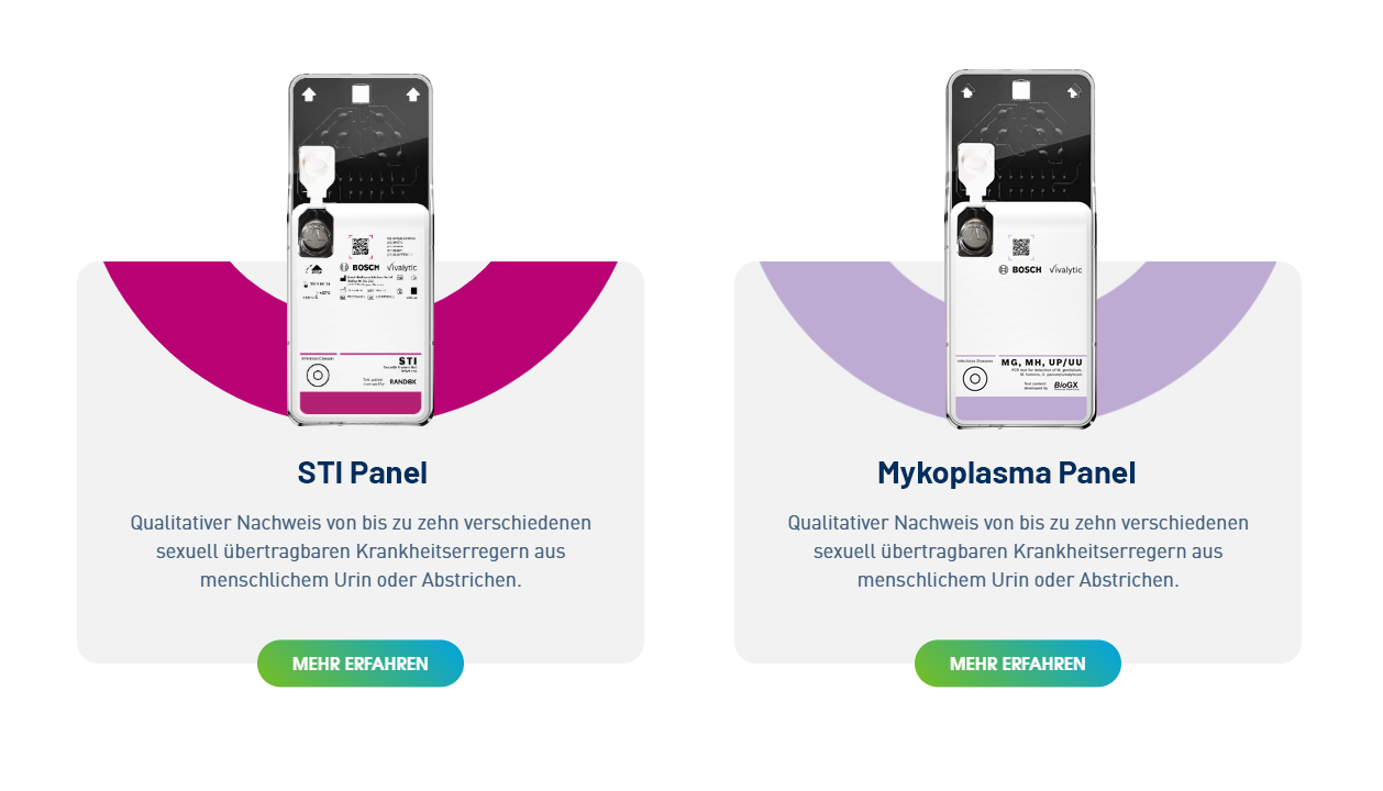
Assay Cards
The assay cards were designed to present specific test panels in a consistent and scalable way. By combining cartridge imagery, category colors, short descriptions and a clear “Mehr erfahren” CTA, each card gave users enough context to understand the test offering without overwhelming them with technical details.
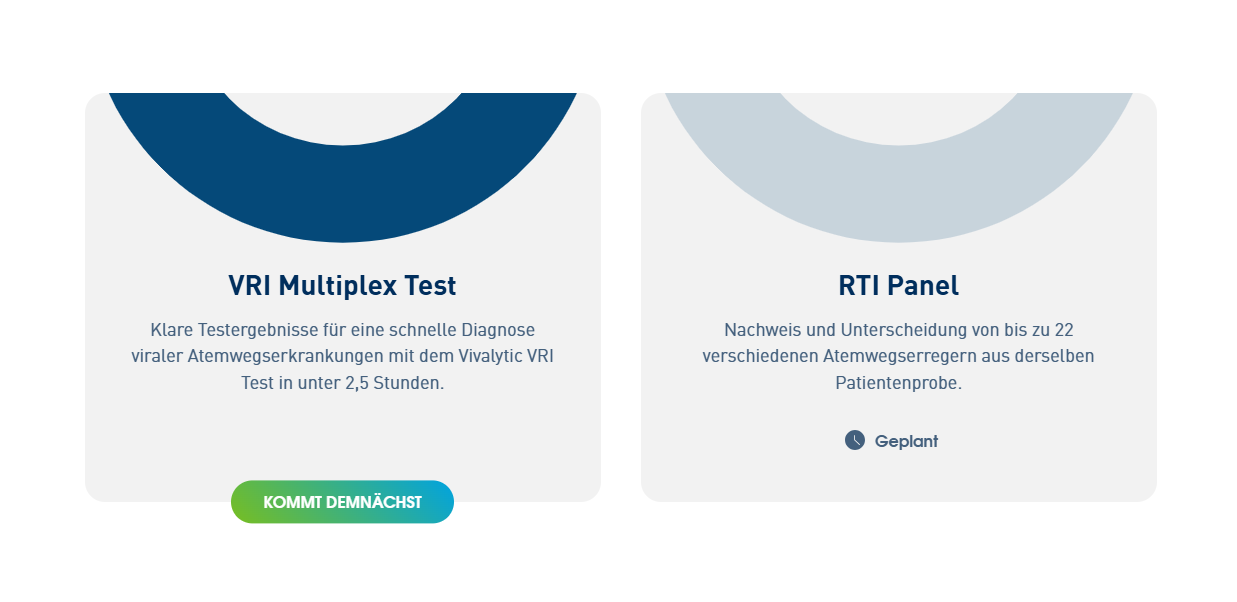
Text-led Utility Cards
For panels or upcoming tests where product imagery was not needed, a reduced card format kept the layout flexible. These text-led cards maintained the same visual rhythm and hierarchy while allowing the platform to communicate lighter content, planned offerings or status updates clearly.
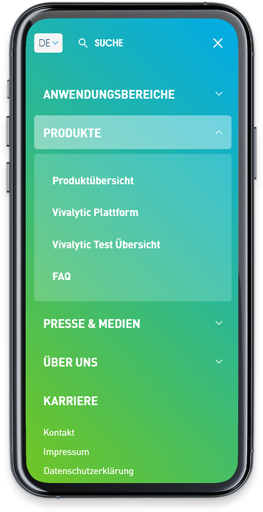
Mobile Screens
The modular structure was adapted for smaller screens, keeping product information, assay categories and contact touchpoints easy to scan on mobile.

Outcome
The final platform gave Aprimeo Diagnostics a dedicated digital presence for presenting the Vivalytic analyzer and its assay portfolio independently from the original product manufacturer. By combining a clear user journey, modular content structure and cohesive visual system, the website helped laboratories and medical specialists understand the product, explore relevant tests and move toward contact or support without being overwhelmed by technical information.
Dedicated product platform
Created a standalone website to present the analyzer, assay menu and support content under Aprimeo’s own visual identity.
Clearer product discovery
Structured the experience around different user needs — from understanding the product to finding relevant applications and tests.
Scalable visual system
Built a modular design language that could support product pages, application pages, assay cards, CTAs and support content consistently.